FlexLayout Container
Description
Used to define the width of controls on a single line.
Discussion
The FlexLayout control makes it easy to dynamically size controls when the orientation of the device changes (mobile devices), or the window size changes (desktop browsers).
The purpose of the FlexLayout container is to dynamically size the widths of controls that are on a single line. This container does not size the height of controls.
For example in the image below, the device is in portrait mode. The button to the right of the textbox control is set to have a fixed size of 80px. The text box has been set to have a flexible width, so it consumes all of the available space (less the built-in padding between controls, defined by the A5CWLayout class padding property).
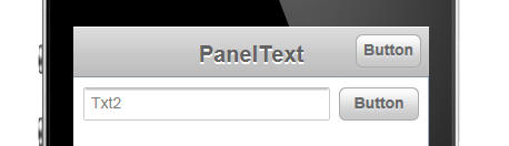
Notice in the image below, when the device orientation is changed to landscape, the button size has not changed - it is still 80px wide. But the textbox had grown in width.

Here is how the textbox and button control are represented in the builder. Note that the controls are wrapped in a container with a sub-type of 'FlexLayout'.

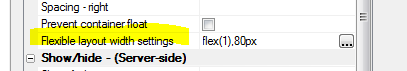
When you set the container sub-type to FlexLayout, a new property in the Property Grid is exposed. The image shows that the 'Flexible layout width settings' have been set to:
flex(1),80px
This means that the first control in the FlexLayout container will have relative width of flex(1) (this is the textbox), and the second control (i.e. the button) will have a fixed width of 80px.
The property has a smart field which brings up a builder to help you set the control widths.
Notice that the builder also shows the 'Defined Width' for each control. The 'Defined Width' is the width that was defined for each individual control.
Typically when you wrap controls in a FlexLayout container, you will want to set each control's Defined Width to 100%. The builder will show you at a glance if any of the top-level controls in the FlexLayout container have not been set to 100%.
The 'Break' column will also show you at a glance if any of the top-level controls in the FlexLayout have breaks after them. You should not have breaks after top-level controls, so the builder will give you a warning to fix this problem.

In the case where only one control in a FlexLayout container has a 'flex' width, the meaning of the flex setting is simply to fill the available space on the line (after allocating space to the fixed size controls).
However, if you have two or more controls with a 'flex' setting, then all of the flex controls together will fill the available space (after allotting space to any fixed size controls), and each 'flex' control will have a relative size based on its 'flex' setting.
For example, if you have two flex controls with settings of flex(1) and flex(2), then the second control will always be twice the width of the first control.
Videos
Responsive Design - Dynamically Resizing Controls on Orientation or Window Size Change - Understanding the FlexLayout Container
A common requirement when designing a UX component is to have a control dynamically resize when the orientation of a mobile device changes or when the window size (in a desktop browser) changes. This is easily accomplished using the FlexLayout container on a UX.
Any of the controls in a FlexLayout container can have their width specified as a 'relative' size (relative to the size of the other controls in the FlexLayout container). This video shows how to use the FlexLayout container type.